Designing with Flair: Best Practices for Using Stylish Fonts in Projects

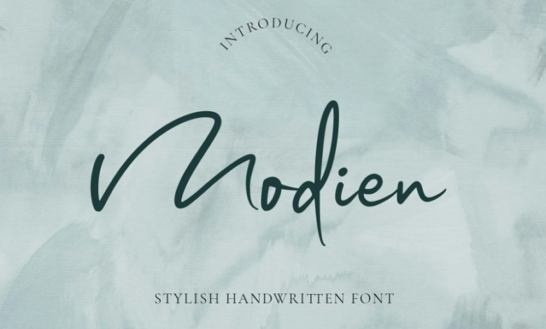
Stylish fonts can dramatically elevate a design project, infusing it with personality, emotion, and visual appeal. Whether you’re creating a brand identity, a website, a poster, or a digital ad, the right typeface can set the tone and make your content stand out. However, using stylish fonts requires more than just picking a trendy typeface—it demands thoughtful application to ensure clarity, cohesion, and effectiveness. Below are the best practices to help you make the most of stylish fonts in your creative projects.
Prioritize Readability and Legibility
While stylish fonts are designed to attract attention, they should never come at the cost of readability. Before finalizing a font, test it at various sizes and weights. Avoid overly decorative or intricate styles for body text, as they can strain the reader’s eyes. Reserve highly stylized fonts for headers, logos, or short highlight phrases, and pair them with a simpler, clean font for paragraphs and longer copy.
Use Stylish Fonts to Establish Visual Hierarchy
Stylish fonts are excellent for creating a visual hierarchy in your design. Use them to guide the viewer’s eye through the layout—starting with bold or ornate headlines, followed by subheadings, and finally, the body text in a more neutral font. Varying the font size, weight, and spacing can help distinguish different levels of information and make the design more digestible.
Pair Fonts Thoughtfully
Combining stylish fonts with complimentary typefaces is both an art and a science. Avoid pairing two highly decorative fonts, as they can clash or overwhelm. Instead, balance one statement font with a neutral or minimalist one—like a classic sans serif or serif. Tools and professional font foundries often suggest font pairings that are proven to work well together, making your choices easier and more effective.
See also: Mastering Numbers with Confidence Tips for Entrepreneurs Who Fear Finances
Limit the Number of Fonts
Too many fonts can make a project look chaotic and unprofessional. A general rule of thumb is to use no more than two or three fonts in a single project. This helps maintain a clean and consistent look. Choose one stylish font for impact, one for supporting content, and possibly a third for special emphasis—making sure all work well together visually and functionally.
Align Fonts with Brand Personality
Stylish fonts should reflect the tone and message of your project. A futuristic, geometric font might suit a tech startup, while a flowing script might be better for a luxury beauty brand. Before selecting a font, define the core values and emotions your project aims to convey, and then choose a typeface that compliments that mood. Consistency in font style reinforces brand identity and ensures a cohesive look across all platforms.
Use Font Weights and Styles Strategically
Many stylish fonts come with multiple weights and styles—regular, bold, italic, condensed, etc. Utilize these variations to create contrast and rhythm within your design. For example, use bold for emphasis or calls to action and lighter weights for supporting details. This not only adds visual interest but also improves comprehension by highlighting important elements.
Test Across Devices and Platforms
Stylish fonts can render differently across browsers and devices. Always test your designs on multiple screens to ensure your typography maintains its impact and readability. For digital projects, use web-safe fonts or ensure your custom font is properly embedded. Load speed and compatibility should not be compromised for visual flair.
License Fonts Appropriately
If you’re using a commercial font, make sure you have the correct license for your project type—whether it’s print, digital, or for apps. Many stylish fonts are premium, and unauthorized use can lead to legal issues. Platforms like TypeType offer both free trials and professional licenses, making it easy to stay compliant.
Conclusion
Stylish fonts are powerful design tools that, when used correctly, can transform ordinary content into something visually captivating and emotionally resonant. By following best practices—focusing on clarity, consistency, appropriate pairing, and brand alignment—you ensure that your fonts do more than just decorate your project—they elevate it. Whether you’re working on a brand identity, website, or digital marketing campaign, let your font choices speak volumes, stylishly and smartly.


